


Event Planning: End-to-End Mobile Web Design 2024
8 Weeks

Sole UX Designer

Figma, Miro, Zoom


Plan like a Pro
PartyBOSS is an all-in-one platform designed for the small and personal event planner, enabling users to plan, search and execute every aspect of an event from start to finish.
With PartyBOSS, users can:
Create Budgets
Track Expenses
Share Calendars
Design and Send Invitations
Market their Event
Search Vendors
Communicate with Team Members
Recruit Volunteers
Gather Feedback from Attendees
Post Reviews
Overwhelming. Chaotic! Intimidating...
Overwhelming. Chaotic! Intimidating...

The Problem
Small and personal event planners often identify the event planning process as chaotic and overwhelming.
While there are plenty of full-service event planning sites for the professional and corporate event planner (at a price), there are none that cater to smaller planners in the same capacity. SignUp Genius offers scheduling and volunteer collaboration. Evite specializes in invitations, and multiple other sites boast venue searches, but none of them offer all of these services in one place.
No wonder the event planning process is stressful!

Affinity Map, Page 1 of 3
The Research
Competitive Analysis: I compared services between four potential competitors and analysized their target market, pricing structure, and basic strengths and weaknesses. I also compared features including applications, social media and blogs, planning tools and feedback inputs.
User Interviews: I conducted remote user interviews with a a total of five small event planners. My users were overwhelmingly female, and between the ages of 25-58. They ranged from young professionals to stay-at-home parents to corporate managers.
Personas: I developed several personas of my users including demographic information, pain points, expectations, priorities and motivations in order to create a “snapshot” of a typical user.
Affinity Mapping: Participants’ responses were separated into twelve catagories ranging from their emotional responses to event planning, to the sites and tools they currently use, to the goals they hope to achieve, to their pain points and past experiences, among others.
POVs/HMWs: POVs and HMWs were developed from user feedback, with the top two concerns being implemented into the user/task flows in the design phase.

Persona
Insights
All of my users relied heavily on email to communicate with team members and guests, but none of them used planning websites for their events (though they did make use of sites including Evite and SignUpGenius for invitations and volunteer coordination).
And though they shared a variety of differing priorities, several common pain points emerged, including managing team members and volunteers and communicating with guests. Overall, people management was identified as a top concern, followed by budget limitations and lack of resources.
Despite budget concerns, all of them expressed interest in an all-in-one planning platform - even for a price!

Storyboard
The Goal
So how to get everyone on the same page? My goal for PartyBOSS was to combine the services of existing party planning sites to an all-in-one platform. Not only would this streamline the event planning process but within this capacity, event planners, team members and guests could collaborate in a dedicated space through email, group chat and text.
In addition to these cross-collaboration tools, I wanted to keep the costs down as budget limitations were also cited as a common pain point. An ad-sponsored site would allow users to take advantage of free services, while advertisers could reach out directly to their target audience. Users would also have the option to upgrade to premium membership, which would be ad-free and include additional storage space and tools.

UI Component Library
The Design
Card Sorting: I conducted further user interviews with over 30 key words and six different categories in a closed card-sort in order to determine the site’s information architecture and navigation.
Results/Similarity Matrix: I created a results and similarity matrix using the feedback from my card sorting exercise. The 32 key words and six categories were organized into a color-coded results matrix by individual user response, and a similarity matrix was used to evaluate the frequency of key word to category associations.
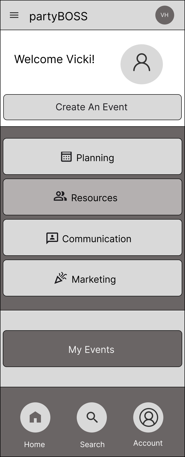
Sitemap: I developed a sitemap using the data from my similarity matrix. The sitemap included a user dashboard and four main categories including planning, communications, marketing and resources, along with a log-in/sign-up screen and contact section.
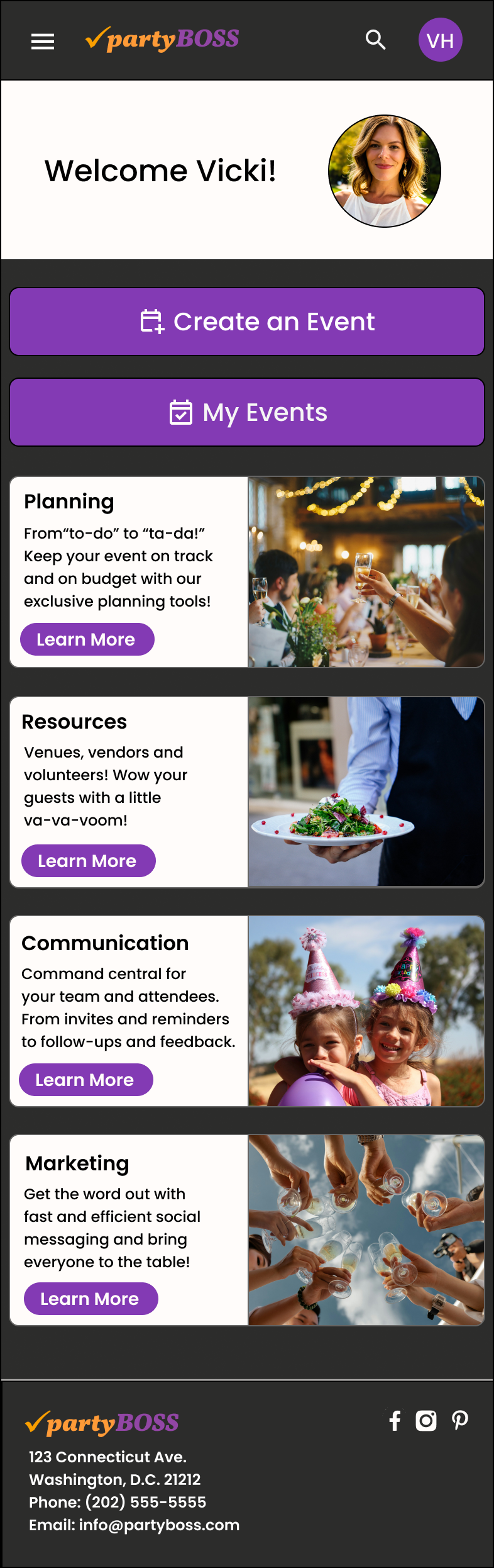
Visual Design: Includes several different versions of the logo, along with a color scheme and font selection for the text and headlines. From there, I developed a User Interface Compenent Library, which further included icon sets, cards, buttons, forms and search fields.
Mid-High Fidelity Wireframes
I created low, mid and high-fidelity wireframes of key screens, including the user dashboard, and select task flows. These evolved through multiple iterations with the inclusion of clickable photos, and buttons. In addition, users suggested moving “My Events” beneath “Create an Event” as those would be frequently used components.
Mid to High-Fidelity Wireframes
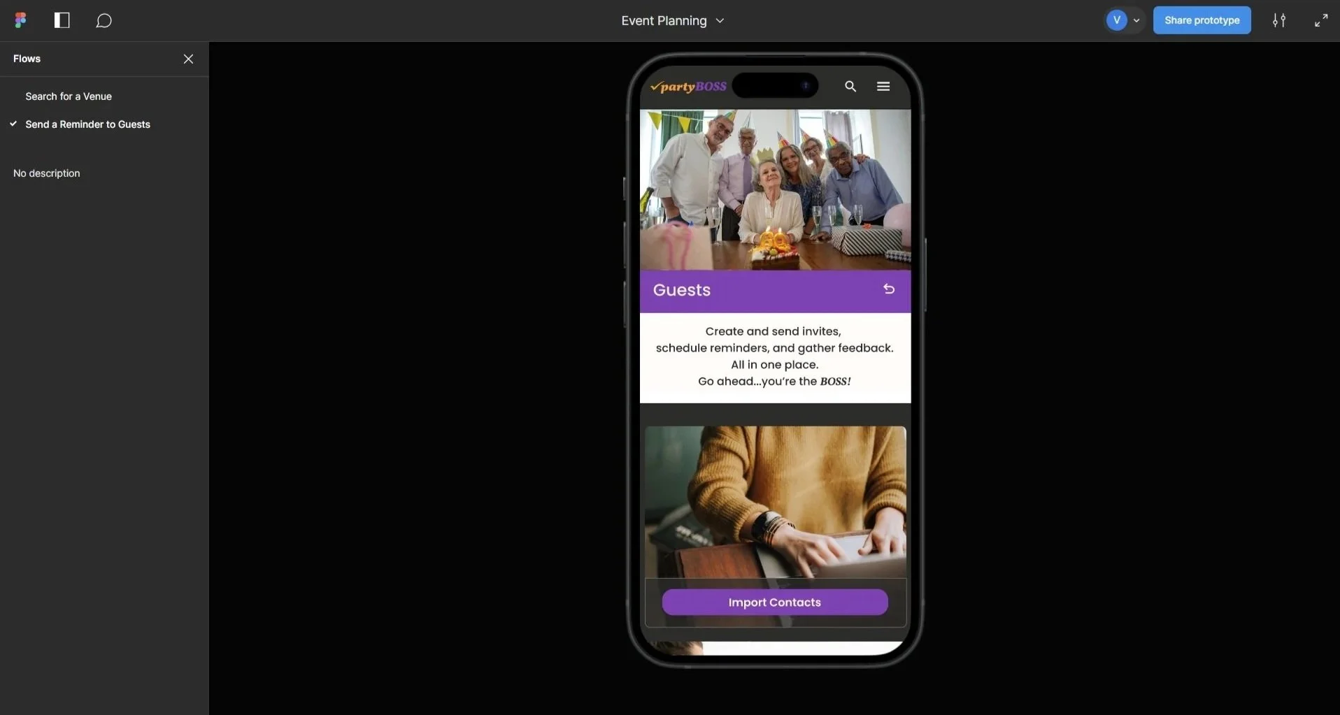
Figma Prototype
Prototyping/Usability Testing: Figma was used to design the wireframes and prototypes and to conduct virtual usability tests with six different users of varying technical ability. Two main task flows were selected for testing:
Searching for a vendor
Sending a reminder to guests.
The time to complete the two tasks ranged from 25-65 seconds. The average number of errors was 1.2. On a scale of 1 to 10, with 10 being the easiest to use, the median score was 9.
Success metrics were measured by time to complete the task in addition to the average number of errors.
Qualitative testing showed that most participants reacted favorably to the site and found it visually appealing and easy to use.
Delivery
Key Findings/Observations
Task flow #1 (Searching for a vendor) was fairly intuitive, though two of my five users thought the task flow should begin with creating the event first. Other users found the terms “Resources” to be too vague, and asked for clarification on what each section entailed. Task flow #2 (Sending a reminder to guests) took less time as users were familiar with the interface from the first task, but feedback included reducing the number of steps to complete the task, and simplifying the input fields. Other users were confused by the intent of the “Messages” icon on the guest communications page. Overall, users appreciated the clean, bright interface and found these tasks fairly simple to navigate.
Alongside strategic tweaks to the language and terminology, the order in which my users executed their planning determined the iterations to my final product, with the creation of a new page to better match their workflow and expectations.

Feedback Grid
Feedback Grid
The feedback grid allowed me to organize
all of the information I gathered during the
usability tests, from what worked well to
pain points and confusion to questions and ideas that arose from the process. By grouping this data, I could instantly see what problems would be high impact, low effort changes based on the amount of participants who struggled, and the preponderance of errors. The most notable differences included swapping out the buttons and icons for cards and images. This not only made it easier for users to navigate the site, but also created additional branding opportunities.

Iterations: Action verbs, shorter descriptions, and clickable photo links
Iterations
After all user feedback was gathered, the following iterations were implemented:
Users were unsure where to begin their journey, so I added a “Create an Event” page under the welcome screen
Users consistently clicked on the photos in the information cards so I added links to them for smoother navigation
Users skimmed over the language on the cards so I simplified it with action verbs and shorter descriptions
Users were confused by some of the terminology, so I changed terms like “Resources” to “Search” and “Messages” to “Inbox” as the original language was too vague
Reflection/Next Steps
There is no shortage of online corporate event planning sites to aid professionals in putting on large business luncheons and glitzy soirees. But what about the small event planner?
Whereas the corporate event planning sites consolidate all of your event planning needs in one site, small and personal event planners must rely on a half-dozen different sites and communicate through multiple channels to acheive the same end. My users overwhelmingly communicated their frustration with searching for venues, communicating with volunteers, and managing a tight budget. It’s hard, and it takes a lot of resources, not to mention coordination and flexibility.
If I were to see this project through, my next steps would include revisiting my existing task flows, and conducting further interviews to determine what filters are most helpful to my users in securing an event location, and how they go about searching for other party resources, including decorations, and entertainment. I would also build out new task flows for designing invitations and importing contacts from email accounts and social media, in addition to building out some of my “Surprising and Delightful” features including an “AI Assistant”, idea generator, and virtual walk-through for event spaces. Finally, I would talk to local businesses to get sponsorship in exchange for advertising on the site to keep these services low-cost or free.

The Final Product
Task Flow #1: Search for a venue
Set-up: Search for a venue in Washington, D.C. that can accomodate 250+ people